
How to create a company's visual identity system
How to create a company's visual identity: from strategy and logo to colour, typography, templates, accessibility and implementation rules.
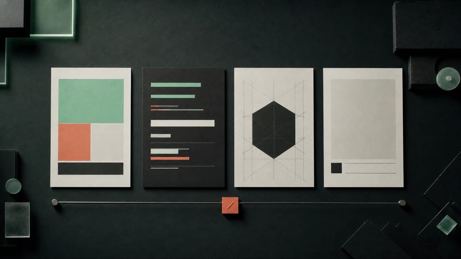
A visual identity system is a set of rules and assets that makes a company look consistent and recognisable across different touchpoints. It includes much more than a logo: colour, typography, layouts, image style, icons, templates and, in a digital product, the behaviour of interface components.
A good identity does not have to look identical on every medium. It should retain a shared language while adapting to a business card, packaging, presentation, website and app. Here is a process for moving from strategy to a system people can use day to day.
Visual identity and branding
Branding shapes the overall meaning and experience of a brand. Visual identity is its visible part: it translates positioning and the character of communication into specific design decisions.
Refreshing a logo alone will not change how a company is perceived if its offer, language and service still contradict the new image. Conversely, a good strategy without practical visual rules quickly dissolves into inconsistent presentations, ads and graphics made by different people.
1. Define the foundations before designing
A designer needs more than the owner's preferences. They need the context behind the decision. A useful brief describes:
- the audience, its situation and decision criteria;
- the offer, positioning and credible differentiators;
- the values and brand traits that should be visible in communication;
- competitors and visual conventions in the category;
- all intended media and technical constraints;
- parts of the current identity worth retaining or retiring.
Gather existing materials and compare them in one place. This audit quickly reveals inconsistent logo versions, accidental colours, missing files and places where form makes the message harder to understand.
2. Establish a direction before refining the mark
Rather than beginning with dozens of logo variants, prepare a few directions that show the relationship between colour, typography, photography and layout. Each should follow the brand foundations, not merely current fashion.
Assess directions against shared criteria: recognisability, fit with the positioning, legibility, room to grow and distinction from close competitors. A discussion of “I like it / I do not like it” is less informative than asking whether a direction supports the goal and works in the most important uses.
At this stage, show samples on realistic media. A mark on an empty background does not reveal whether the system can handle a long heading, product photo or tiny label.
3. Design the system elements
The scope depends on the company, but a complete system normally covers these areas:
| Element | What to establish |
|---|---|
| Logo and mark | Primary version, horizontal or vertical versions, single-colour versions, clear space and minimum size. |
| Colours | Colour roles, print and screen values, valid combinations and required contrast. |
| Typography | Families and weights for headings, copy, data and office use; licence rules and fallbacks. |
| Photography and illustration | Subjects, cropping, lighting, treatment, icon style and examples of unsuitable materials. |
| Grid and composition | Margins, spacing, proportions, information hierarchy and behaviour across formats. |
| Business materials | Templates for presentations, documents, proposals, business cards, social media, ads or packaging. |
| Digital interface | Buttons, forms, messages, active states, errors and core product components. |
Not every organisation needs every element on day one. Prioritise materials used most often and those that directly affect sales or service. A system can grow in modules, provided its rules are clear from the beginning.
4. Check accessibility and production
An identity has to work beyond the designer's screen. The logo should remain legible at a small size, the palette should work in required print processes, and typography should include Polish characters and needed weights. Prepare scalable vector files and properly optimised raster formats for digital channels.
In interfaces, do not rely on colour alone to convey information. Check text and control contrast, keyboard-focus visibility, enlarged content and longer language versions. A brand colour can remain important, but not every shade is suitable for text or a button.
Also settle rights to fonts, photos, illustrations and icons. The team should know where they may be used and who renews licences. Missing this information can block implementation just as effectively as a missing logo file.
5. Test the system with real content
Before approval, apply the identity to several extreme situations: a small profile icon, a long PDF proposal, a phone screen, a slide with a chart and a black-and-white printout. Use real photographs, service names, prices and error messages.
A short audience test can check what traits people assign to the design, whether they recognise the company among competitors and whether they can find the most important information. The point is not to vote for the prettiest variant. Feedback matters when it relates to the task and the criteria agreed in the brief.
6. Prepare rules and files for implementation
A logo guide usually explains logo use. A broader brand book or system library also explains typography, colour, photography, composition, material examples and visual tone. The document should be short enough for the team to use and specific enough to reduce guesswork.
Alongside the documentation, deliver an organised source package:
- logo variants in SVG, PDF and everyday-use formats;
- colour swatches and values for screen and print;
- font files or instructions for obtaining the correct licences;
- editable templates in the tools used by the team;
- components, styles or tokens for the website and product;
- rules for file names, versioning and approving changes.
Name an owner for the system. Without someone responsible for updates, alternative colours, old templates and accidental mark variants will reappear within a few months.
When should you refresh an identity, and when rebuild it?
A refresh is enough when the brand is recognised but materials are inconsistent, digital uses have not been described, or the system does not keep up with new channels. In that case, preserve key assets and add the missing rules.
A deeper change makes sense when the company has changed its positioning, merges several brands, the current look misleads its audience, or it cannot be implemented correctly. Do not change everything merely to look “more modern”, though. The cost is not only design work; it also includes replacing materials, training the team and losing some existing recognition.
Finally, assess the system with three questions: can the right audience recognise the brand, can the team create consistent materials independently, and does the form make content easier rather than harder to absorb? If you need to design or organise such a system, see our visual identity service for companies.

Author
Maciej Szukalski
Founder of Condictor · systems architect · research and development
He has designed and built digital products since 2014. He specialises in architecture, research, and applications with automation and intelligence layers.
See experience and working principlesHave a problem to solve?
Let’s find the right first step
Describe your situation in a few sentences. We’ll return with questions or a concrete proposal for what comes next.