
Information architecture in website design
What information architecture is and how to organise navigation, content, and search so that users reach their goal faster.
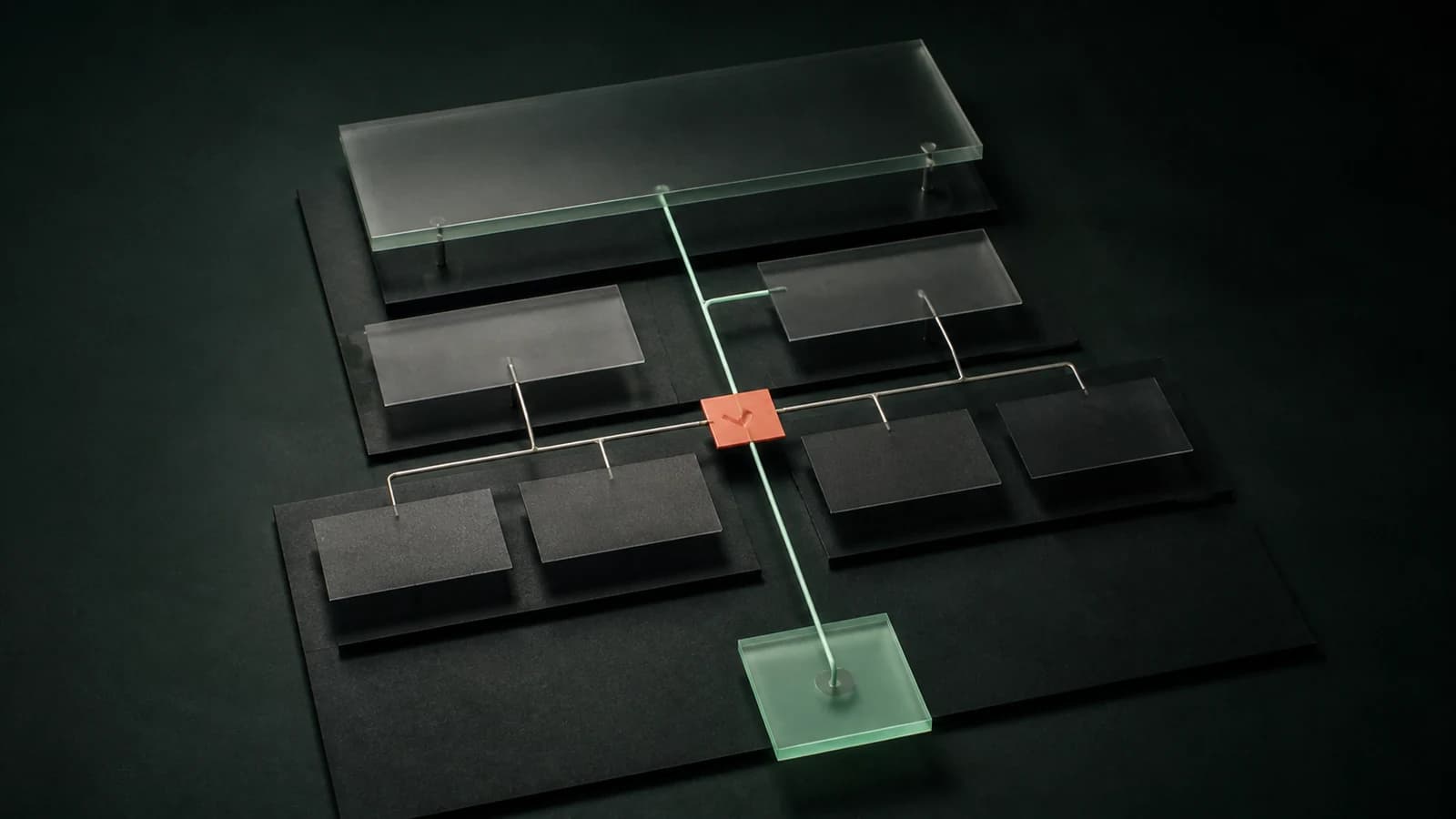
What is information architecture?
Information architecture is the way content, functions, and data are organised so that a person can find what they need and complete a task without guessing where to click. It is not decoration or only a site map. It includes decisions about categories, labels, navigation, search, and the sequence of information.
The practical test is simple: does a first-time visitor understand what is here and what to do next? If someone cannot find a product, form, or cooperation rules, a beautiful interface will not solve the problem.
Start with tasks, not the menu
Name the most important user tasks first. In a shop they may be finding a product, comparing variants, and buying. In a B2B application they may be checking a case, adding data, or handing a task onward. In a service website they are understanding the offer and beginning a conversation.
Then design the structure. A useful rule is: one task should have one obvious path. That does not require a flat menu; it requires category names, filters, and buttons that do not compete for the same decision.
Four components of good architecture
Organisation
Group information by a model that makes sense to the user, not to the company chart. A sales team may say “premium package” while a customer searches for a solution to a concrete problem.
Labels
A label is a menu, button, filter, or form-field name. It should describe an outcome rather than internal jargon. Clear labels reduce the need for explanation and make search and support more reliable.
Navigation
Navigation tells people where they are, where they can go, and how to return. Larger services benefit from category hierarchy, breadcrumbs, search, and meaningful internal links. The goal is not more menu items; it is a shorter path to what people actually seek.
Search
Search helps where a catalogue is large, a visitor knows an item’s name, or a question does not fit the category tree. It does not replace poor structure: if most people must search for basic functions, the problem lies earlier.
How to test it
Choose three important tasks, ask a few people outside the project to complete them without help, and record where they hesitate, return, or choose the wrong category. This is more useful than the opinion that “the menu looks good.”
The same discipline matters in an application, knowledge base, RAG project, or knowledge graph. Before connecting data, define stable concepts, metadata, versions, ownership, and the relationships between documents and processes. A model cannot repair ambiguous labels or documents nobody can find.
For a larger product, we help turn those decisions into an application delivery plan. Read also about UI/UX design.

Author
Maciej Szukalski
Founder of Condictor · systems architect · research and development
He has designed and built digital products since 2014. He specialises in architecture, research, and applications with automation and intelligence layers.
See experience and working principlesHave a problem to solve?
Let’s find the right first step
Describe your situation in a few sentences. We’ll return with questions or a concrete proposal for what comes next.